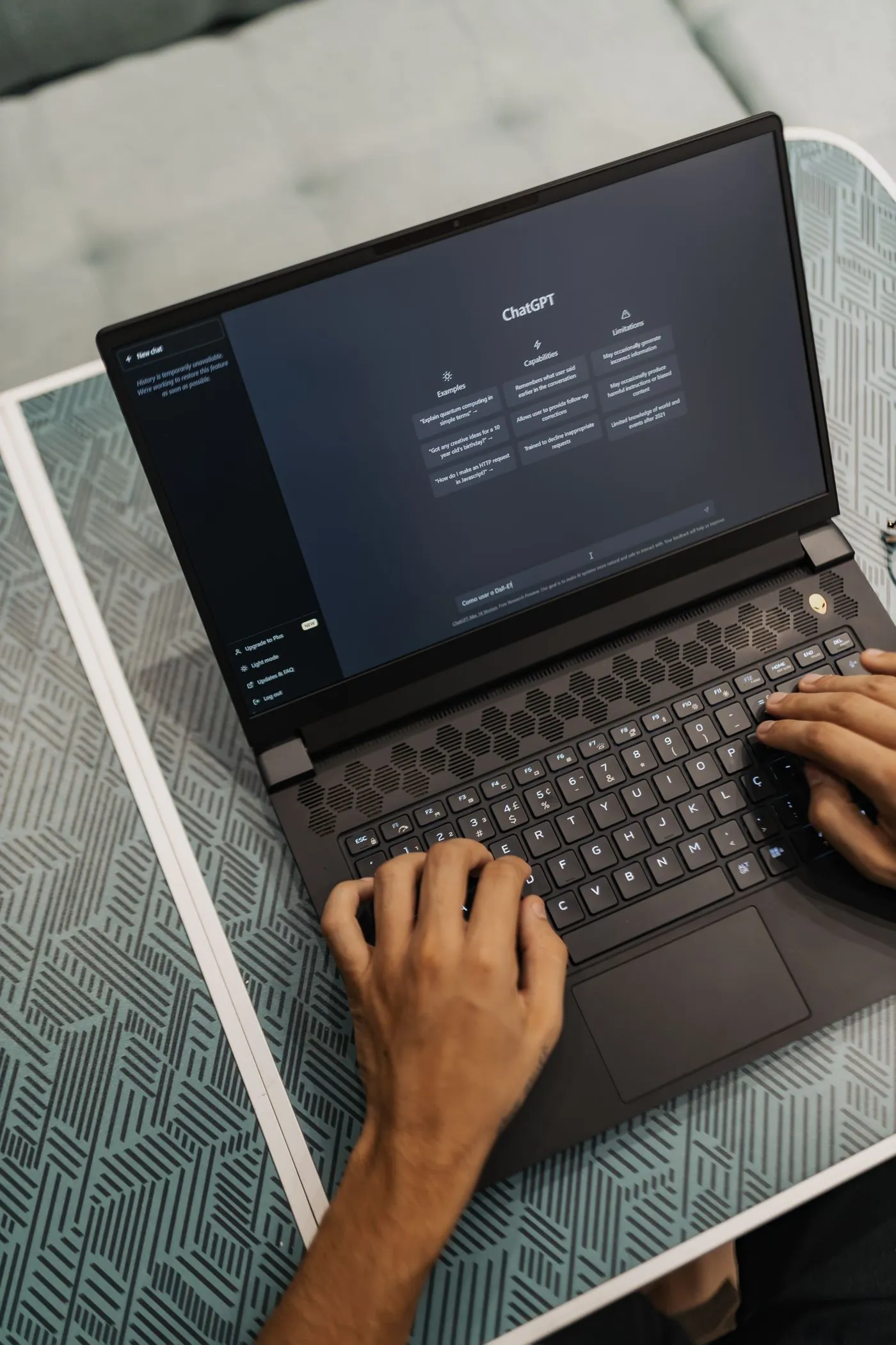
A chat widget can look simple while being difficult to operate with a keyboard or screen reader. New messages arrive dynamically, the window opens over existing content, and controls often rely on small icons. Include these behaviors in the agency brief so accessibility is part of the conversation design rather than a final visual inspection.
Related service: Custom AI chatbot development- 01Open and orient
- 02Enter and correct
- 03Read updates
- 04Close or transfer
SECTION 01
Define the interaction before choosing a widget
Tell the agency whether the chat is a modal overlay or a non-modal panel. The choice affects how keyboard focus behaves and whether the underlying page remains operable. Specify where focus goes when chat opens, how a visitor closes it, and where focus returns. Avoid trapping users in a panel with no discoverable exit.
Give buttons meaningful labels, including send, retry, attach and remove attachment. Explain validation errors next to the relevant input and preserve the visitor's draft after an error. W3C's keyboard criterion concerns functionality, not merely whether pressing Tab highlights something. Ask for a task-based test rather than an automated score alone.
SECTION 02
Illustrative example: an interrupted support question
Imagine a keyboard user opens the panel, writes a long question and loses connectivity. The draft remains intact. A concise connection status becomes available without stealing focus. After reconnection, the user sends once, reaches the new response and can follow its source link without losing their place in the conversation.
For a streaming answer, the visual presentation can update gradually while assistive announcements use an intentional strategy, such as announcing completion and making the response easy to navigate. The exact approach needs testing with supported browsers and screen readers. Announcing every token or always forcing focus onto the latest message can interrupt reading.
SECTION 03
Include content and failure states in acceptance
Review long answers, numbered instructions, source links, an empty transcript, a failed send and a human-handoff receipt. Test enlarged text and narrow screens so controls do not overlap. Do not rely on color alone to distinguish the visitor from the assistant or to communicate an error. Keep link wording understandable outside its surrounding paragraph.
W3C's status-message guidance supports exposing important updates programmatically without unnecessary focus changes. Ask the agency to document tested device and assistive-tool combinations, known issues and ownership of future widget updates. An existing component may reduce work, but its default settings are not proof that your integrated conversation is accessible.
SECTION 04
Frequently asked questions
Is an accessible launcher enough?
No. The message composer, history, source links, error recovery and close controls all need to work throughout the conversation.
Should every arriving message move keyboard focus?
Usually that would interrupt the user's current task. Use a deliberate announcement and navigation pattern, then test it with the intended assistive tools.
Can an automated scan approve the chatbot?
It can identify some defects, but it cannot replace manual conversation testing, including keyboard use and dynamic message behavior.
PRIMARY REFERENCES
Sources and further reading
These references cover the standards, platforms, or published prices discussed in the guide. Worked examples and checklists are our editorial guidance.
- Keyboard accessibilityW3C WAI
- Accessible status messagesW3C WAI
EDITORIAL METHOD
About this guide
We use AI to assist with drafting and editing. Catapult AI Work is responsible for the published content. Examples illustrate possible approaches; they are not client case studies unless identified as such.
Budget examples are not Catapult package prices. Check linked provider pages for current fees and plan limits before making a purchase.
Read the editorial policy